Home
About
Resume
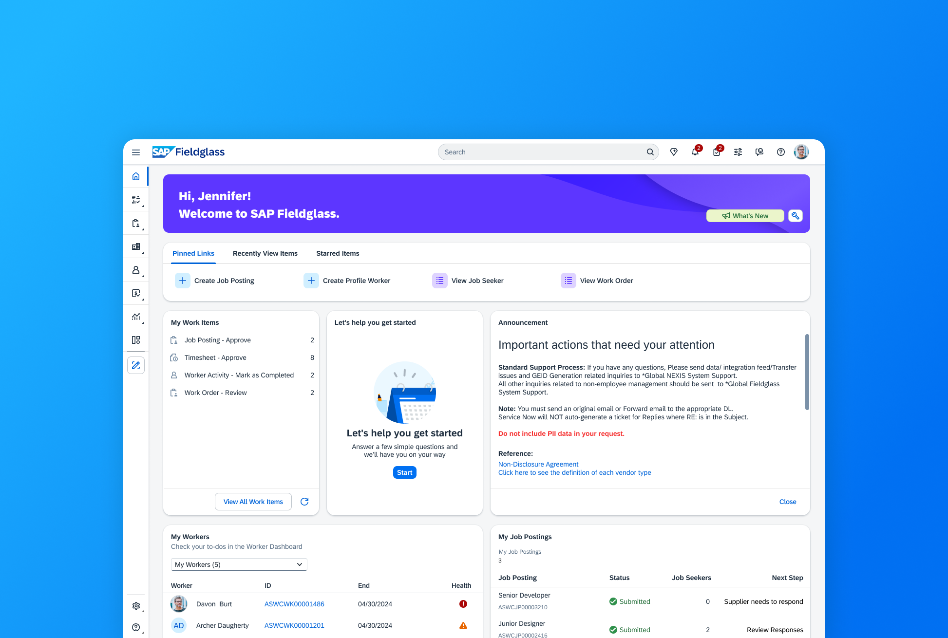
Redesigning the SAP Fieldglass Homepage: From Widget Chaos to Role-Based Clarity
B2B Saas
Platform Design
I led the UX redesign of SAP Fieldglass’s homepage, a high-visibility, strategic initiative across product, engineering, and executive stakeholders, transforming it into a dynamic, role-based dashboard used by over 1,000 enterprise clients.
This project was spotlighted in 👉 SAP’s public UX updates. Internal reception has been overwhelmingly positive.
Role
Product Designer
Team
2 designers, 1 PM, 6 developers, 1 researcher, 1 QA, 1 tech writer
Timeline
Jan 2024 - Nov 2024 (shipped)
Context: What is SAP Fieldglass?
SAP Fieldglass is an enterprise SaaS platform that helps large organizations manage their external workforce and vendor relationships at scale. As a global B2B product, it supports complex workflows and compliance needs across different industries and markets.
However, despite its robust backend and business value, the homepage had become a source of confusion rather than clarity. There have been persistent user feedback that the homepage is hard to navigate and completely unintuitive.
In early 2024, I was tasked with redesigning this critical touchpoint. The project was one of SAP Fieldglass’s strategic priorities for the year, supported by product and design leadership.
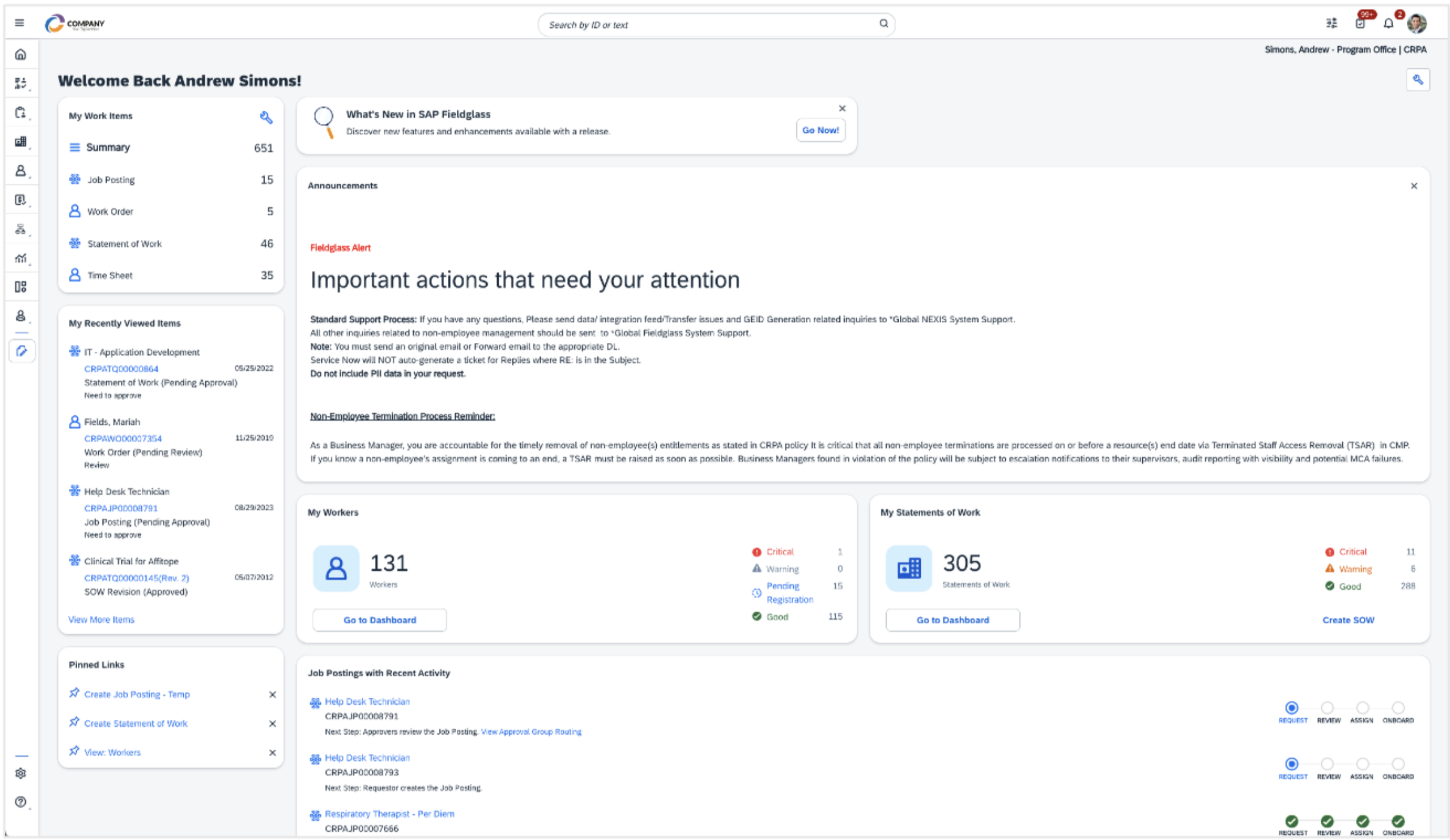
This is how our homepage used to look like...
Problem Framing: Beyond Visual Design
This redesign started with a clear but narrow executive mandate: adopt cards from the standard JavaScript framework SAP UI5 to modernize the homepage and can enable future integrations across SAP platforms.
However as designer, I knew this visual upgrade would only scratch the surface. The redesign couldn’t just be about better-looking cards, it needed to solve foundational UX and workflow issues.
📐
What the Leadership Wanted
✅
Implement SAP UI5 Cards
✅
Ensure widget modularity & platform alignment
🧱
Treat redesign as a visual/technical refresh
🔎
What I Observed
⚠️
Users were overwhelmed by unprioritized content
⚠️
Same layout forced on vastly different roles
⚠️
Tasks buried in visual noise
Turning Insight into Strategy
Clearly, a one-size fits all solution was actively getting in the way. During an early brainstorm with another designer, we proposed an ambitious idea: introduce a role-based homepage template system.
We validated our proposal through Qualtrics survey data, user interviews, and stakeholder feedback.
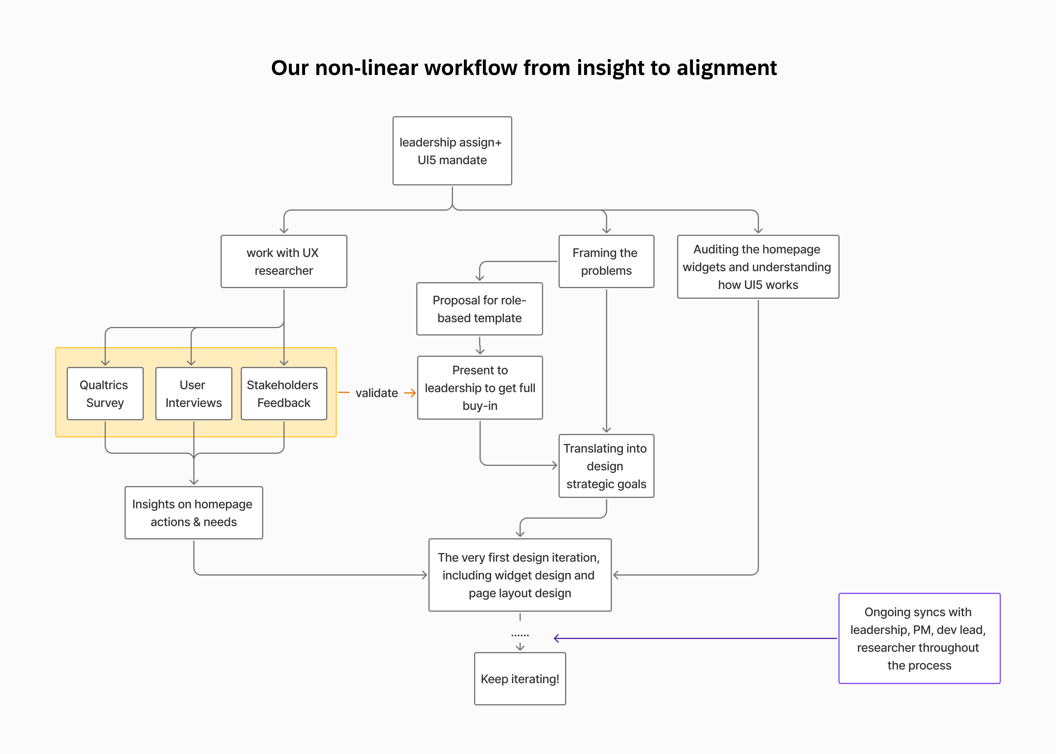
This diagram shows how design, research, and product evolve together
Creating personalized experiences in a B2B system wouldn’t work like dynamic, Spotify-style behavior-based recommendations. Instead, we envisioned a structure like this:
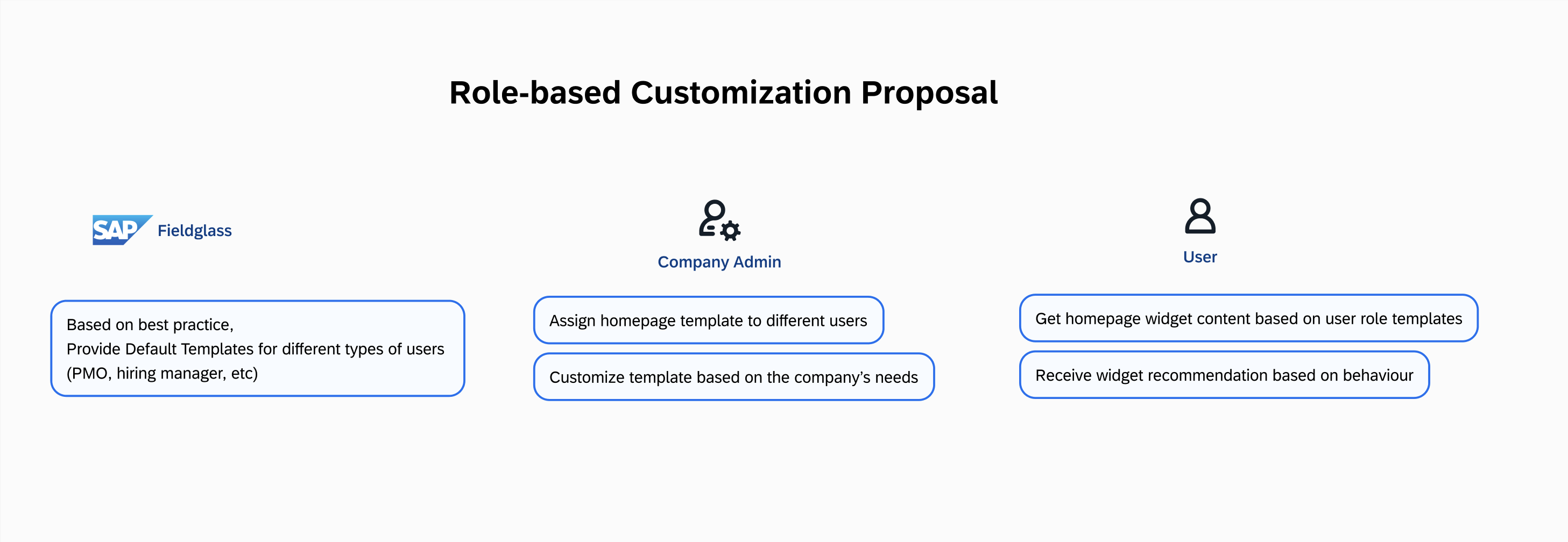
The role-based homepage proposal received strong approval and was implemented. The widget recommendation idea on the user side was deprioritized due to scope constraints, but still considered a strong long-term direction.
Translating Insights into Design Goals
Based on insights gathered from my domain observations, UX research findings, and ongoing cross-functional syncs, we translated broad platform pain points into clear, scalable design goals:
Flexible and Adaptive Layout
Design a dynamic and modular layout that adapts to various user workflows, allowing for personalization and prioritization of tasks according to user roles
Role-based Content Delivery
Develop a dynamic content delivery system that tailors homepage information to user roles, ensuring relevance and reducing information overload.
Improved Navigation
Surface frequently used pages and features more prominently.
Modernized Design with UI5 Cards
Design a dynamic and modular layout that adapts to various user workflows, allowing for personalization and prioritization of tasks according to user roles
How we got there
Translating our design strategies into a usable system meant resolving real design complexity. My focus was on reducing noise while enabling flexibility, and we approached it through parallel focused streams:
🧩 Persona to Template
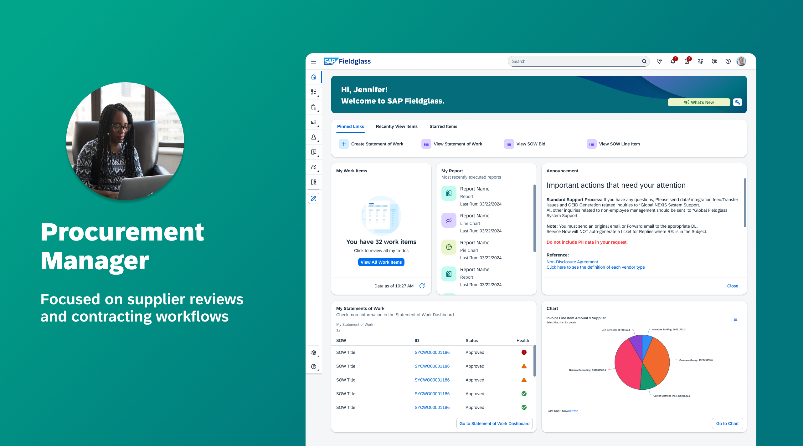
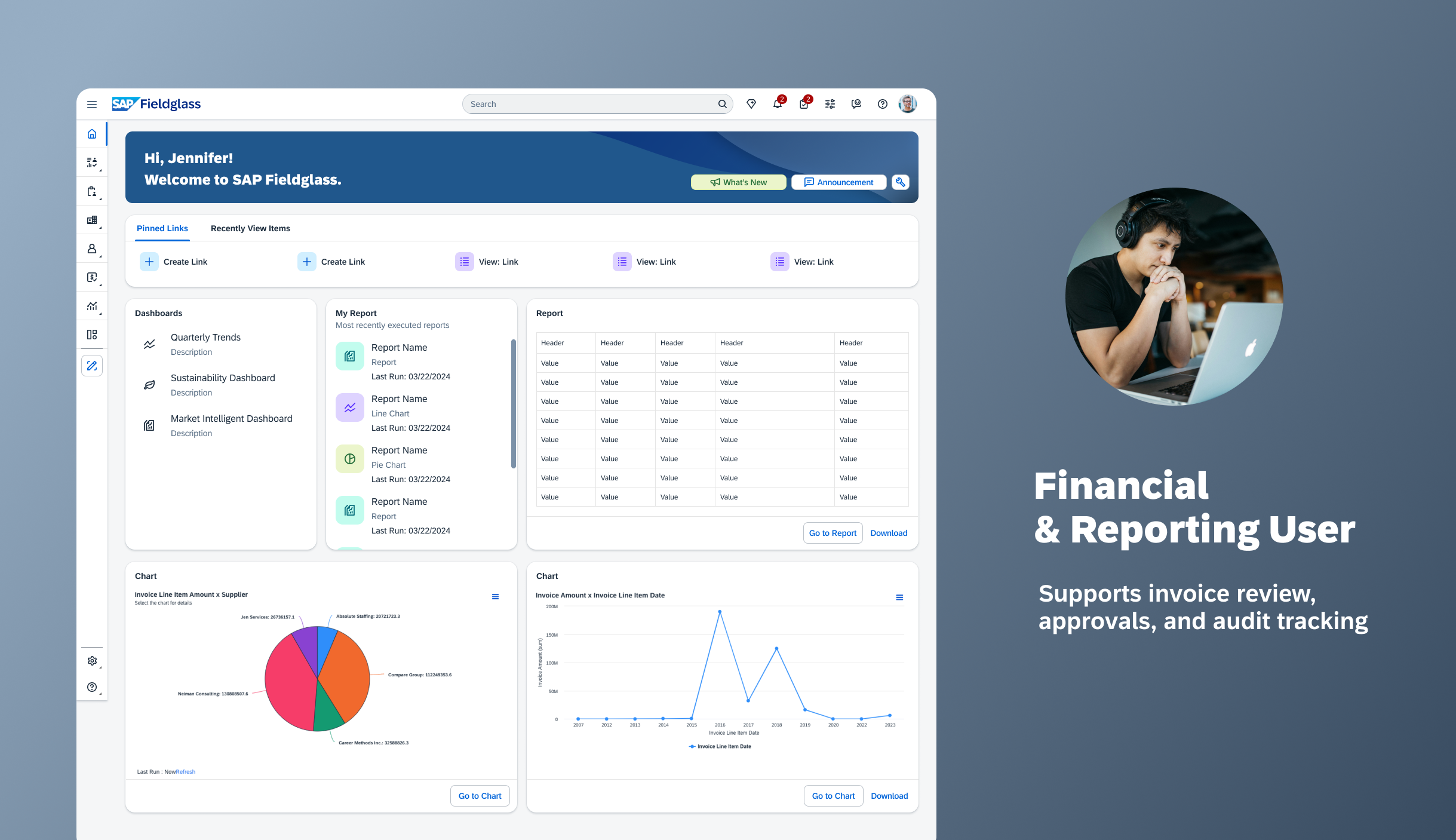
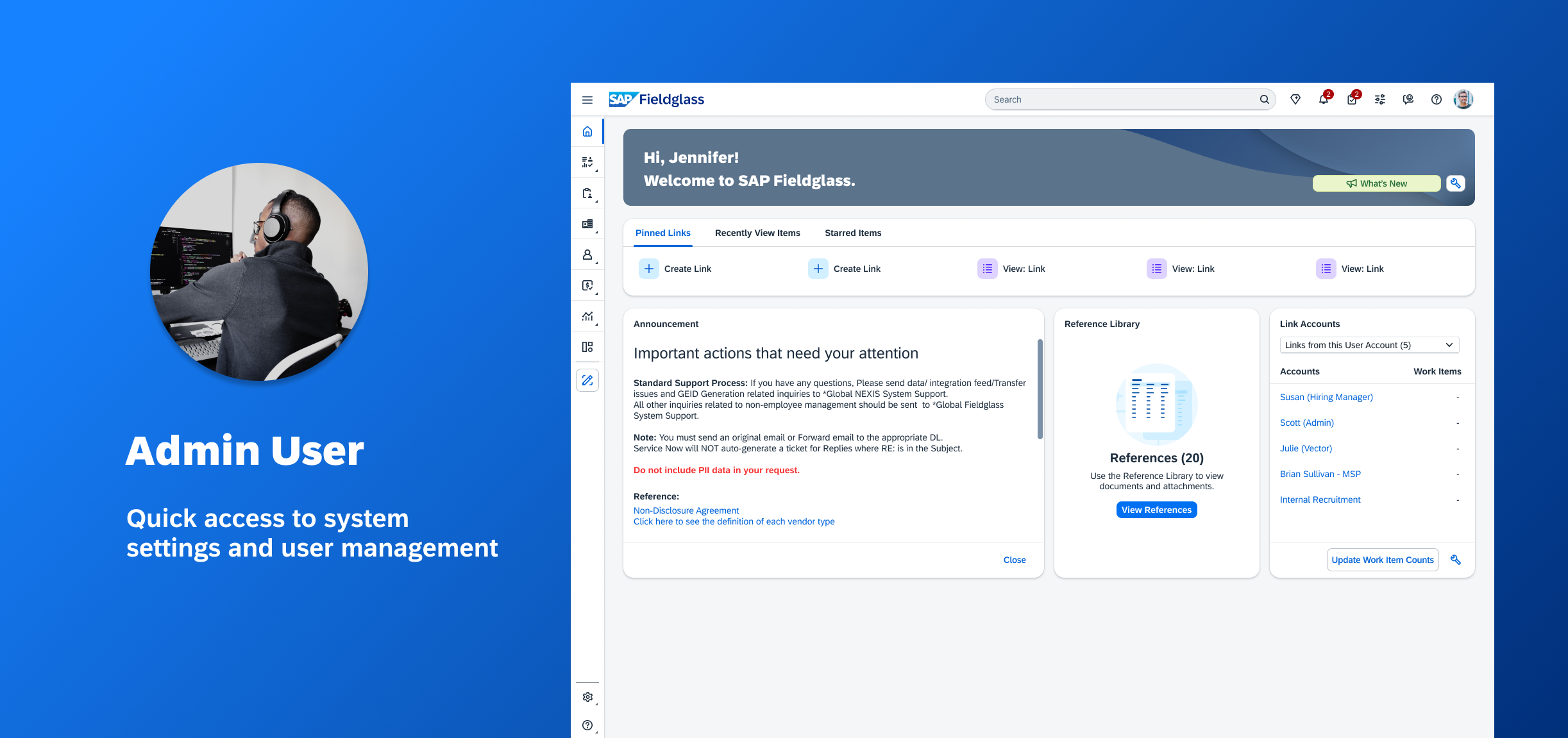
Working closely with our PM and UX researcher, we identified key personas: Hiring Manager (contingent and SOW), PMO, Financial Approver, and Admin. Each role required different widgets, layouts, and information priority, so we reverse-engineered user workflows into homepage actions, and then matched them to essential widgets.
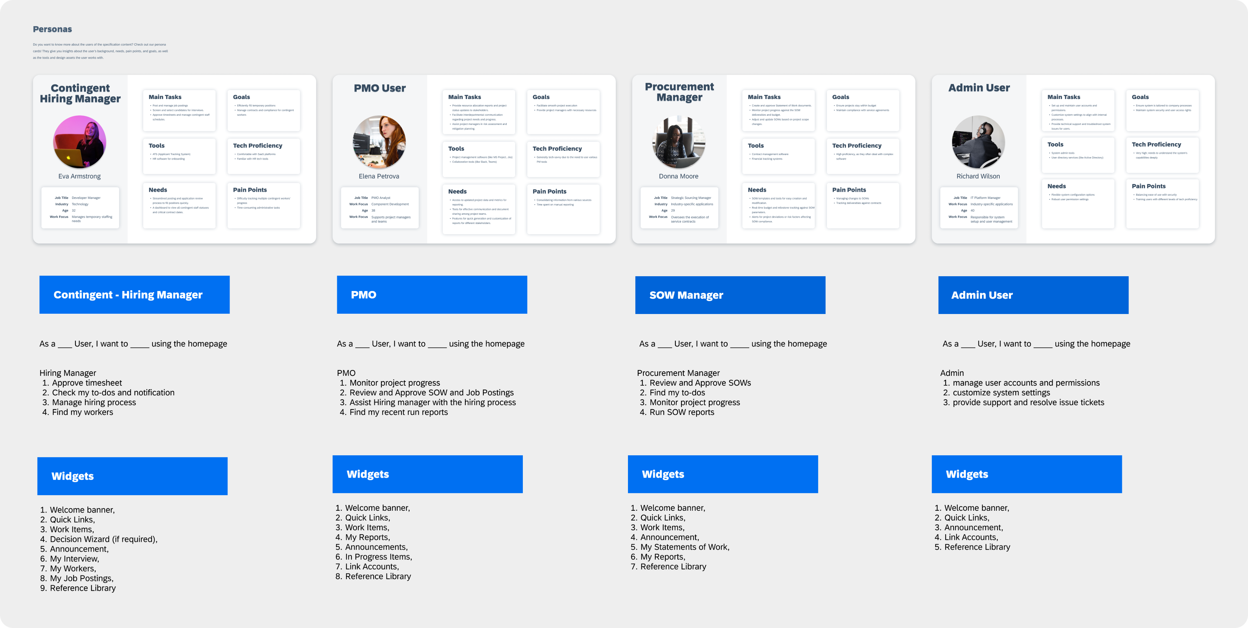
Each persona’s goals, behaviors, and key actions informed which widgets were prioritized on their homepage
🖌️ Condensing the widgets and applying a flexible layout
I led a full audit of homepage widgets, worked with our PM and researcher to map core user actions (e.g., posting a job, reviewing SOWs) and determined what information truly needed to be surfaced. This reverse-mapping allowed us to cut noise and prioritize action, transforming the homepage from a wall of widgets into a focused control center
We applied a flexible 4-column grid layout that allowed widgets to scale, supporting single, double, and full-width modules.
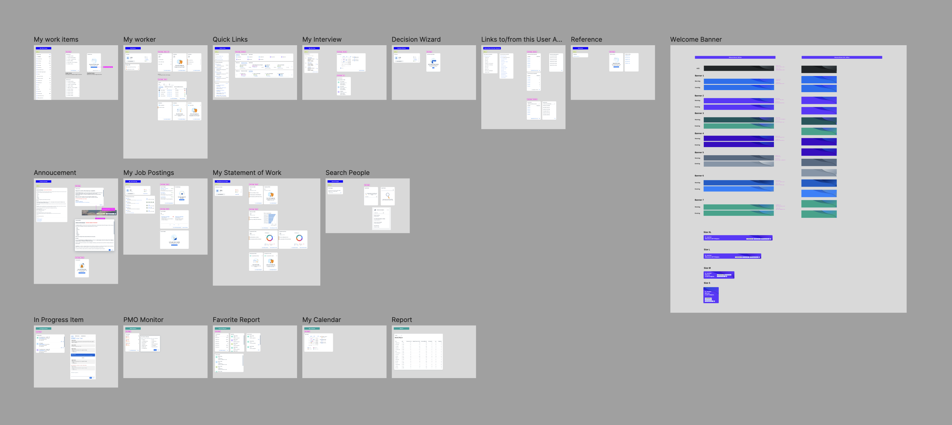
A snapshot of our widget audit and exploration in the process
The Outcome: What We Shipped
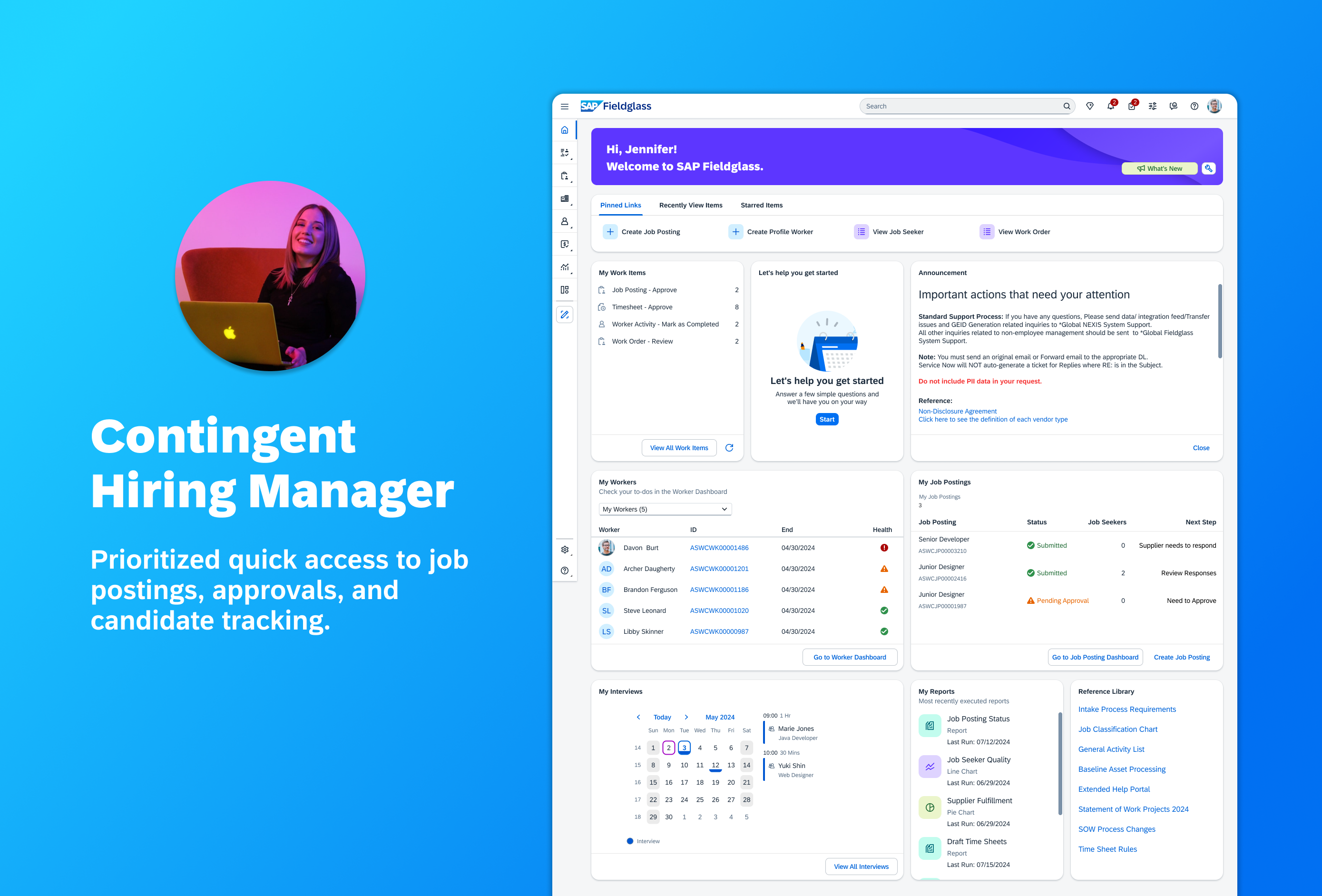
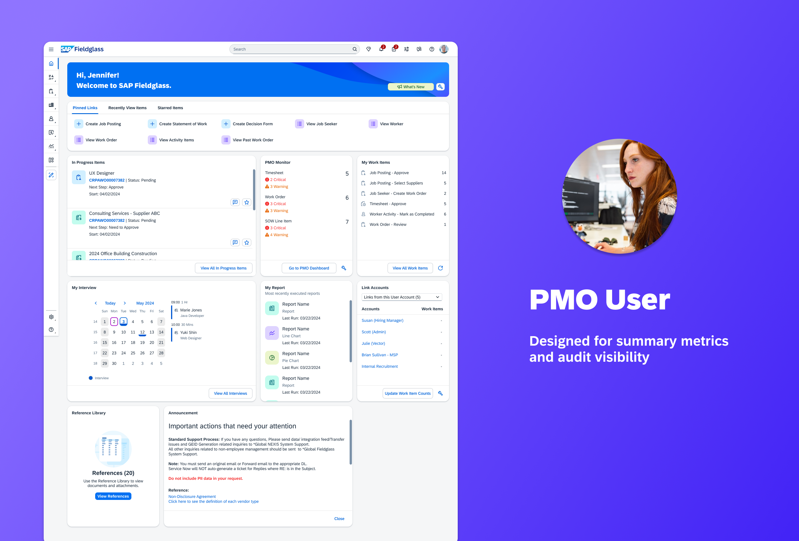
A modular, adaptive homepage now supports SAP UI5 cards and a scalable 4-column layout system. Our modular structure made it easy to adapt layouts when new needs emerged later in the roadmap.
Impact & Reception
Launched in November 2024, the redesigned SAP Fieldglass homepage became the default landing experience for thousands of enterprise companies. While full metrics are still being consolidated, early signals show strong adoption and alignment with SAP’s long-term platform strategy.
🌎
Global Rollout
Rolled out to 1,180+ enterprise clients across 190+ countries
🏢
Trusted by Industry Leaders
Supports Fortune 500 external workforce management across 21 languages and $20B+ in Q1 spend.
🎉
Strong Internal Reception
Highlighted in SAP’s Q1 2025 UX Update and featured on SAP’s official LinkedIn channel

Redesigning the SAP Fieldglass Homepage: From Widget Chaos to Role-Based Clarity
B2B Saas
Platform Design
I led the UX redesign of SAP Fieldglass’s homepage, a high-visibility, strategic initiative across product, engineering, and executive stakeholders, transforming it into a dynamic, role-based dashboard used by over 1,000 enterprise clients.
This project was spotlighted in 👉 SAP’s public UX updates. Internal reception has been overwhelmingly positive.
Role
Product Designer
Team
2 designers, 1 PM, 6 developers, 1 researcher, 1 QA, 1 tech writer
Timeline
Jan 2024 - Nov 2024 (shipped)
Context: What is SAP Fieldglass?
SAP Fieldglass is an enterprise SaaS platform that helps large organizations manage their external workforce and vendor relationships at scale. As a global B2B product, it supports complex workflows and compliance needs across different industries and markets.
However, despite its robust backend and business value, the homepage had become a source of confusion rather than clarity. There have been persistent user feedback that the homepage is hard to navigate and completely unintuitive.
In early 2024, I was tasked with redesigning this critical touchpoint. The project was one of SAP Fieldglass’s strategic priorities for the year, supported by product and design leadership.

This is how our homepage used to look like...
Problem Framing: Beyond Visual Design
This redesign started with a clear but narrow executive mandate: adopt cards from the standard JavaScript framework SAP UI5 to modernize the homepage and can enable future integrations across SAP platforms.
However as designer, I knew this visual upgrade would only scratch the surface. The redesign couldn’t just be about better-looking cards, it needed to solve foundational UX and workflow issues.
📐
What the Leadership Wanted
✅
Implement SAP UI5 Cards
✅
Ensure widget modularity & platform alignment
🧱
Treat redesign as a visual/technical refresh
🔎
What I Observed
⚠️
Users were overwhelmed by unprioritized content
⚠️
Same layout forced on vastly different roles
⚠️
Tasks buried in visual noise
Turning Insight into Strategy
Clearly, a one-size fits all solution was actively getting in the way. During an early brainstorm with another designer, we proposed an ambitious idea: introduce a role-based homepage template system.
We validated our proposal through Qualtrics survey data, user interviews, and stakeholder feedback.

This diagram shows how design, research, and product evolve together
Creating personalized experiences in a B2B system wouldn’t work like dynamic, Spotify-style behavior-based recommendations. Instead, we envisioned a structure like this:

The role-based homepage proposal received strong approval and was implemented. The widget recommendation idea on the user side was deprioritized due to scope constraints, but still considered a strong long-term direction.
Translating Insights into Design Goals
Based on insights gathered from my domain observations, UX research findings, and ongoing cross-functional syncs, we translated broad platform pain points into clear, scalable design goals:
Flexible and Adaptive Layout
Design a dynamic and modular layout that adapts to various user workflows, allowing for personalization and prioritization of tasks according to user roles
Role-based Content Delivery
Develop a dynamic content delivery system that tailors homepage information to user roles, ensuring relevance and reducing information overload.
Improved Navigation
Surface frequently used pages and features more prominently.
Modernized Design with UI5 Cards
Design a dynamic and modular layout that adapts to various user workflows, allowing for personalization and prioritization of tasks according to user roles
How we got there
Translating our design strategies into a usable system meant resolving real design complexity. My focus was on reducing noise while enabling flexibility, and we approached it through parallel focused streams:
🧩 Persona to Template
Working closely with our PM and UX researcher, we identified key personas: Hiring Manager (contingent and SOW), PMO, Financial Approver, and Admin. Each role required different widgets, layouts, and information priority, so we reverse-engineered user workflows into homepage actions, and then matched them to essential widgets.

Each persona’s goals, behaviors, and key actions informed which widgets were prioritized on their homepage
🖌️ Condensing the widgets and applying a flexible layout
I led a full audit of homepage widgets, worked with our PM and researcher to map core user actions (e.g., posting a job, reviewing SOWs) and determined what information truly needed to be surfaced. This reverse-mapping allowed us to cut noise and prioritize action, transforming the homepage from a wall of widgets into a focused control center
We applied a flexible 4-column grid layout that allowed widgets to scale, supporting single, double, and full-width modules.

A snapshot of our widget audit and exploration in the process
The Outcome: What We Shipped
A modular, adaptive homepage now supports SAP UI5 cards and a scalable 4-column layout system. Our modular structure made it easy to adapt layouts when new needs emerged later in the roadmap.


Impact & Reception
Launched in November 2024, the redesigned SAP Fieldglass homepage became the default landing experience for thousands of enterprise companies. While full metrics are still being consolidated, early signals show strong adoption and alignment with SAP’s long-term platform strategy.
🏢
Trusted by Industry Leaders
Supports Fortune 500 external workforce management across 21 languages and $20B+ in Q1 spend.
🎉
Strong Internal Reception
Highlighted in SAP’s Q1 2025 UX Update and featured on SAP’s official LinkedIn channel
Home
About
Resume

Redesigning the SAP Fieldglass Homepage: From Widget Chaos to Role-Based Clarity
B2B Saas
Platform Design
I led the UX redesign of SAP Fieldglass’s homepage, a high-visibility, strategic initiative across product, engineering, and executive stakeholders, transforming it into a dynamic, role-based dashboard used by over 1,000 enterprise clients.
This project was spotlighted in 👉 SAP’s public UX updates. Internal reception has been overwhelmingly positive.
Role
Product Designer
Team
2 designers, 1 PM, 6 developers, 1 researcher, 1 QA, 1 tech writer
Timeline
Jan 2024 - Nov 2024 (shipped)
Context: What is SAP Fieldglass?
SAP Fieldglass is an enterprise SaaS platform that helps large organizations manage their external workforce and vendor relationships at scale. As a global B2B product, it supports complex workflows and compliance needs across different industries and markets.
However, despite its robust backend and business value, the homepage had become a source of confusion rather than clarity. There have been persistent user feedback that the homepage is hard to navigate and completely unintuitive.
In early 2024, I was tasked with redesigning this critical touchpoint. The project was one of SAP Fieldglass’s strategic priorities for the year, supported by product and design leadership.

This is how our homepage used to look like...
Problem Framing: Beyond Visual Design
This redesign started with a clear but narrow executive mandate: adopt cards from the standard JavaScript framework SAP UI5 to modernize the homepage and can enable future integrations across SAP platforms.
However as designer, I knew this visual upgrade would only scratch the surface. The redesign couldn’t just be about better-looking cards, it needed to solve foundational UX and workflow issues.
📐
What the Leadership Wanted
✅
Implement SAP UI5 Cards
✅
Ensure widget modularity & platform alignment
🧱
Treat redesign as a visual/technical refresh
🔎
What I Observed
⚠️
Users were overwhelmed by unprioritized content
⚠️
Same layout forced on vastly different roles
⚠️
Tasks buried in visual noise
Turning Insight into Strategy
Clearly, a one-size fits all solution was actively getting in the way. During an early brainstorm with another designer, we proposed an ambitious idea: introduce a role-based homepage template system.
We validated our proposal through Qualtrics survey data, user interviews, and stakeholder feedback.

This diagram shows how design, research, and product evolve together
Creating personalized experiences in a B2B system wouldn’t work like dynamic, Spotify-style behavior-based recommendations. Instead, we envisioned a structure like this:

The role-based homepage proposal received strong approval and was implemented. The widget recommendation idea on the user side was deprioritized due to scope constraints, but still considered a strong long-term direction.
Translating Insights into Design Goals
Based on insights gathered from my domain observations, UX research findings, and ongoing cross-functional syncs, we translated broad platform pain points into clear, scalable design goals:
Flexible and Adaptive Layout
Design a dynamic and modular layout that adapts to various user workflows, allowing for personalization and prioritization of tasks according to user roles
Role-based Content Delivery
Develop a dynamic content delivery system that tailors homepage information to user roles, ensuring relevance and reducing information overload.
Improved Navigation
Surface frequently used pages and features more prominently.
Modernized Design with UI5 Cards
Design a dynamic and modular layout that adapts to various user workflows, allowing for personalization and prioritization of tasks according to user roles
How we got there
Translating our design strategies into a usable system meant resolving real design complexity. My focus was on reducing noise while enabling flexibility, and we approached it through parallel focused streams:
🧩 Persona to Template
Working closely with our PM and UX researcher, we identified key personas: Hiring Manager (contingent and SOW), PMO, Financial Approver, and Admin. Each role required different widgets, layouts, and information priority, so we reverse-engineered user workflows into homepage actions, and then matched them to essential widgets.

Each persona’s goals, behaviors, and key actions informed which widgets were prioritized on their homepage
🖌️ Condensing the widgets and applying a flexible layout
I led a full audit of homepage widgets, worked with our PM and researcher to map core user actions (e.g., posting a job, reviewing SOWs) and determined what information truly needed to be surfaced. This reverse-mapping allowed us to cut noise and prioritize action, transforming the homepage from a wall of widgets into a focused control center
We applied a flexible 4-column grid layout that allowed widgets to scale, supporting single, double, and full-width modules.

A snapshot of our widget audit and exploration in the process
The Outcome: What We Shipped
A modular, adaptive homepage now supports SAP UI5 cards and a scalable 4-column layout system. Our modular structure made it easy to adapt layouts when new needs emerged later in the roadmap.


Impact & Reception
Launched in November 2024, the redesigned SAP Fieldglass homepage became the default landing experience for thousands of enterprise companies. While full metrics are still being consolidated, early signals show strong adoption and alignment with SAP’s long-term platform strategy.
🌎
Global Rollout
Rolled out to 1,180+ enterprise clients across 190+ countries
🏢
Trusted by Industry Leaders
Supports Fortune 500 external workforce management across 21 languages and $20B+ in Q1 spend.
🎉
Strong Internal Reception
Highlighted in SAP’s Q1 2025 UX Update and featured on SAP’s official LinkedIn channel
Home
About
Resume